BC Home Builders Branding
BC Home Builders approached me with a concern about the consistency of the look and feel of their marketing materials. They were interested in a branding package and guidelines to help ensure cohesive visuals. As a well-established business, the objective was to build around their existing logo, with some slight tweaks. The goal was to make it more friendly and convey the quality of their craftsmanship.
Keeping the structure of the logo, the corners were rounded, font was changed, and the deepened red for better contrast on light backgrounds.
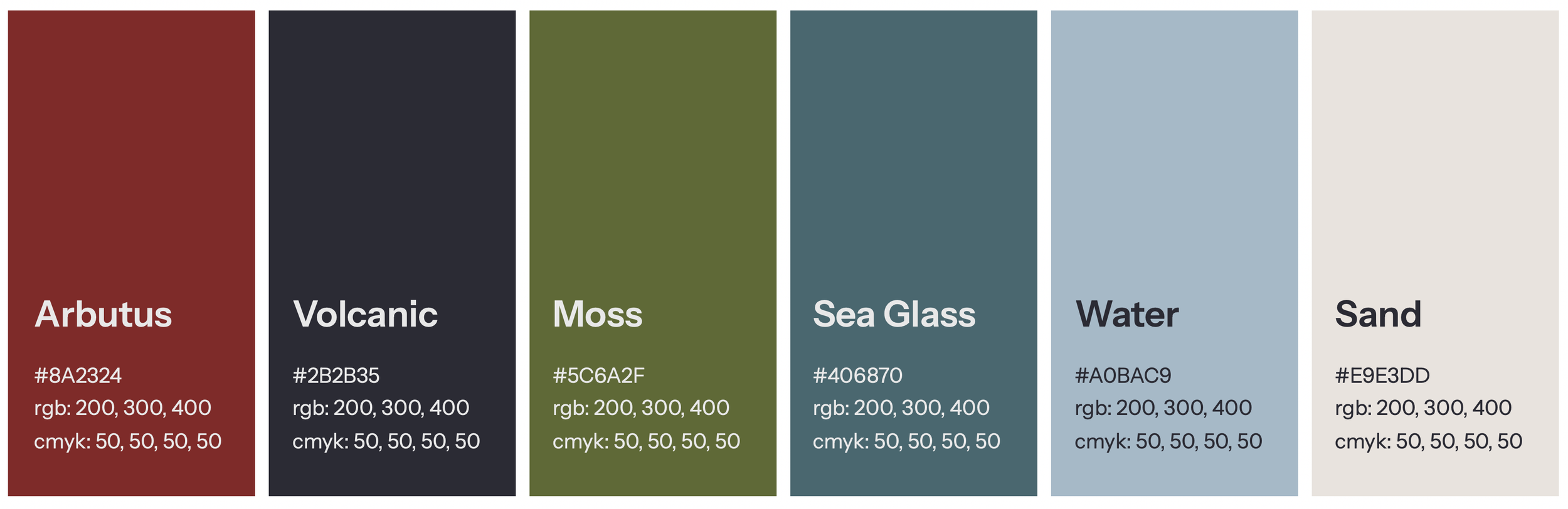
Building around the strong red in their logo, inspiration was drawn from the environment, which could also double for building materials!
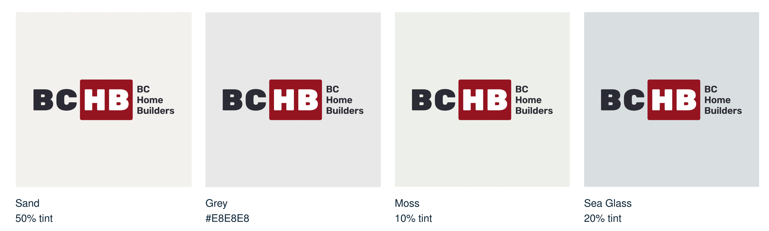
To ensure the palette was accessible for all visual abilities, colour pairings were suggested that met the minimum contrast ratio of 4.5:1.
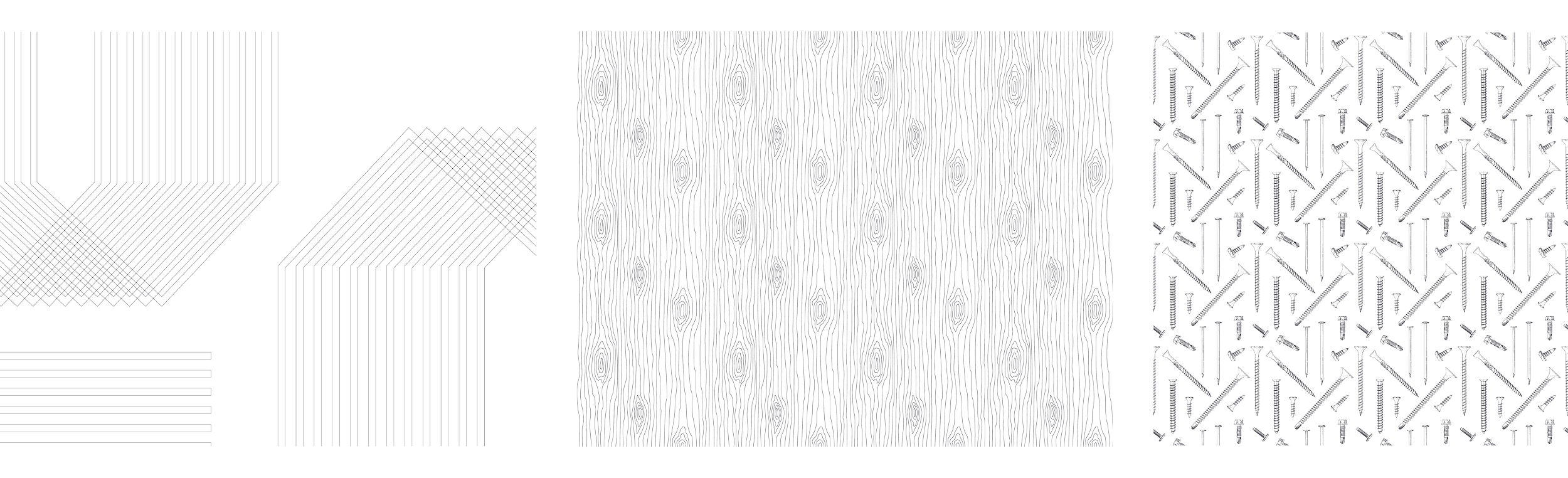
A suite of background patterns were created for visual interest and texture.
To effectively tell the story about what BC Home Builders does, custom illustrations were created that represent each facet of their work (new construction, project management, renovations).
Custom hand-drawn illustrations were created to make sure there were enough visual elements that could be used at different scales, conveying the idea of hand-crafted work.